How to Improve UI/UX by improving the visibility of the system status?
Seven examples from my experience on how to improve visibility of the system status
Hello friends 👋, in this article, we will have a quick look at the first rule from 10 Usability Heuristics for User Interface and see some examples.
Motivation
The cover photo is from inside of a Melbourne tram. There is a clear sign inside that tells passengers what the next stop is (The yellow text) and that someone has requested to stop at the next station (red text, otherwise the tram does not always stop for all stations).
(Photo by Rishiraj Singh Parmar from Pexels)
You can see the same type of feedback or visibility in many everyday items.
Like the notification from your phone on low battery, your TV showing an animation when loading a movie on Netflix, or the green camera LED light on your MacBook to show that camera is recording.

This is what your users expect when presented with a website or web application you design. To know where they are and what is happening.
Let's see how this applies to UI/UX
Jakob Nielsen wrote an article in 1994 about "10 Usability Heuristics for User Interface".
They are called “heuristics” because they are broad rules of thumb and not specific usability guidelines.
Many UI/UX designers indeed rely on good examples and their gut feeling when they design. This is good and, in many cases, does the trick for designing a solid UI/UX.
In my opinion, the next level would be to understand the common patterns and the science behind them.
Most UI/UX design techniques have scientific reasons, resulting from human psychology studies and human-computer interaction research. It’s good to know whys as well as good examples.
Let's look at the first rule,
Rule 1: Visibility of system status
The system should always keep users informed about what is going on, through appropriate feedback within a reasonable time.
Read the full article on the visibility of system status and watch 3 min video on the visibility heuristic.
As you can see, the definition is very high-level, so that you can bring it to life in many ways. Visual feedback can exist in the form of colour, state changes (e.g. success or error messages), progress indicators and many more UI/UX components.
Let's look at some of the examples of how to achieve Visibility of system status
1. Use an Empty state message to improve the visibility of your system status.
Empty states can display a wide variety of content. For example, they can include a list without items, or a search that returns no results. Although these states aren’t typical, they should be designed to prevent confusion.
You can find the definition of this pattern in different design systems. Like Material design from google.
Or Carbon design from IBM
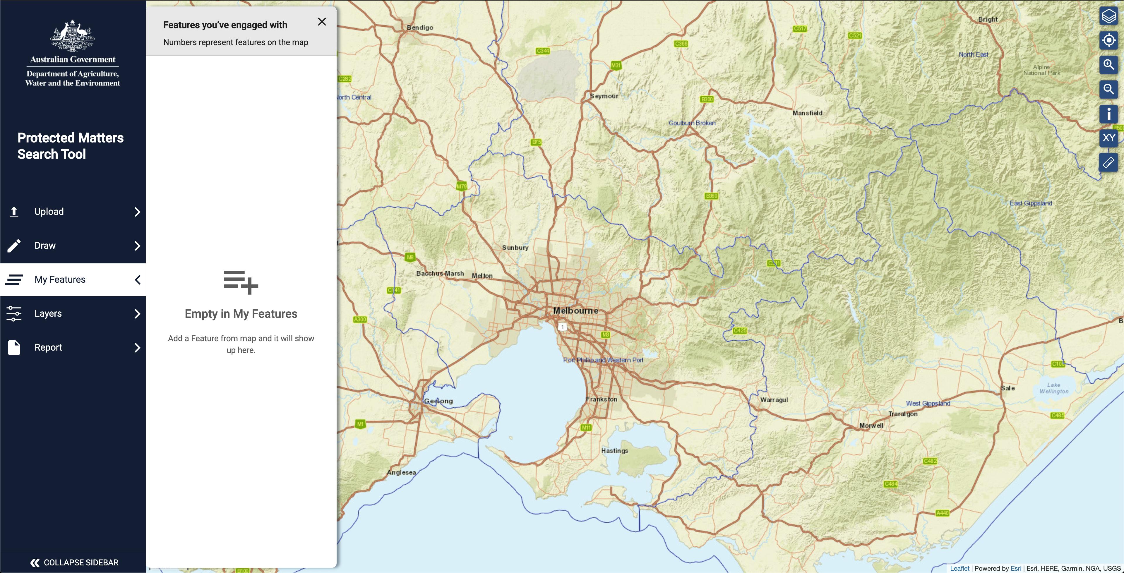
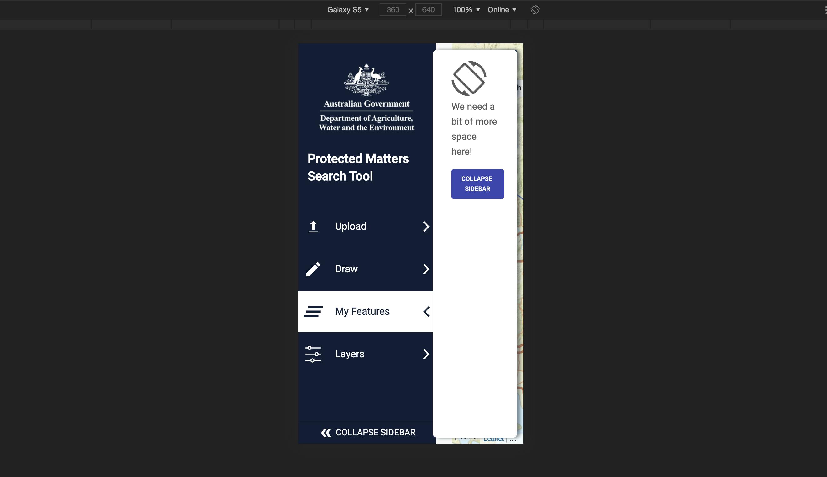
Here is a couple of examples from the PMST tool that uses the empty state to communicate to the user about the next step.
Asking the user to add items to the map to use the "My Features" panel.
Asking the user to use a wider screen. Alternatively, they can collapse the sidebar or rotate the phone to landscape, giving the app enough space to show the map.
2. You can use Skeleton loading to improve the visibility of your system
Based on the carbon design system [carbondesignsystem.com/patterns/loading-pat..
Skeleton loading or Placeholder loading is used when information takes an extended amount of time to process and appear on-screen.
Skeleton states are simplified versions of components used on an initial page load to indicate that the information on the page has not fully loaded yet.
They should only appear for a few seconds, disappearing once components and content populate the page. Skeleton states use motion to convey that the page is not stuck and that data is still being loaded.
This can help to reduce user uncertainty. Only use skeleton states on container-based components like tiles and structured lists or data-based components like data tables and cards. In most cases, action components (e.g. buttons, input fields, checkboxes, toggles) do not need a skeleton state.
Never represent toast notifications, overflow menus, dropdown items, modals, and loaders with skeleton states. Elements inside a modal may have a skeleton state, but the modal itself should not.

You can implement the skeleton loading using
Or use a library to help you.
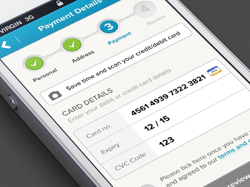
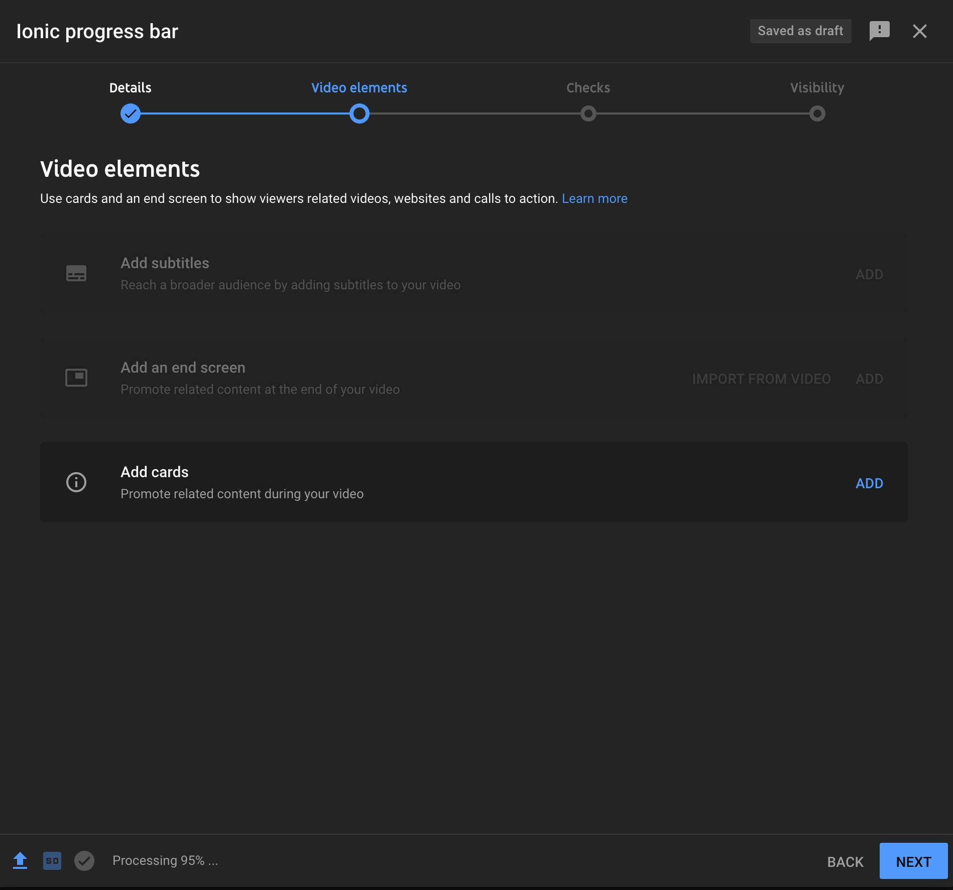
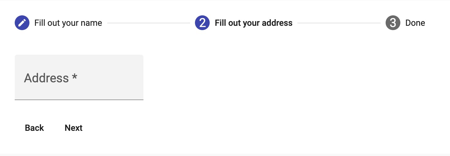
3. Use a progress tracker to show where the user is in a workflow
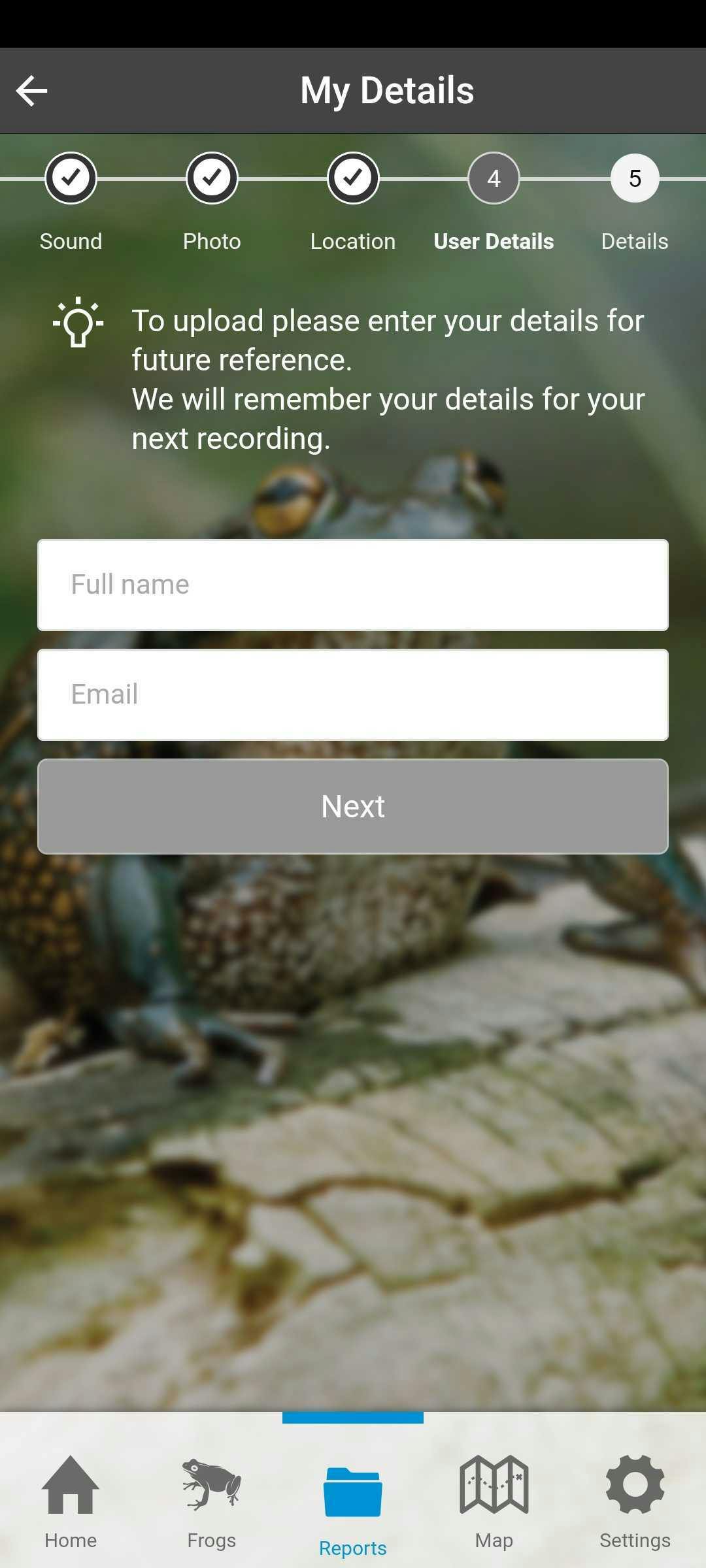
I love making progress and love a good progress tracker to show me where I am in a workflow. One of the most common examples is online shopping. This also encourages the user to continue and finish by knowing that there is, for example, one step left.
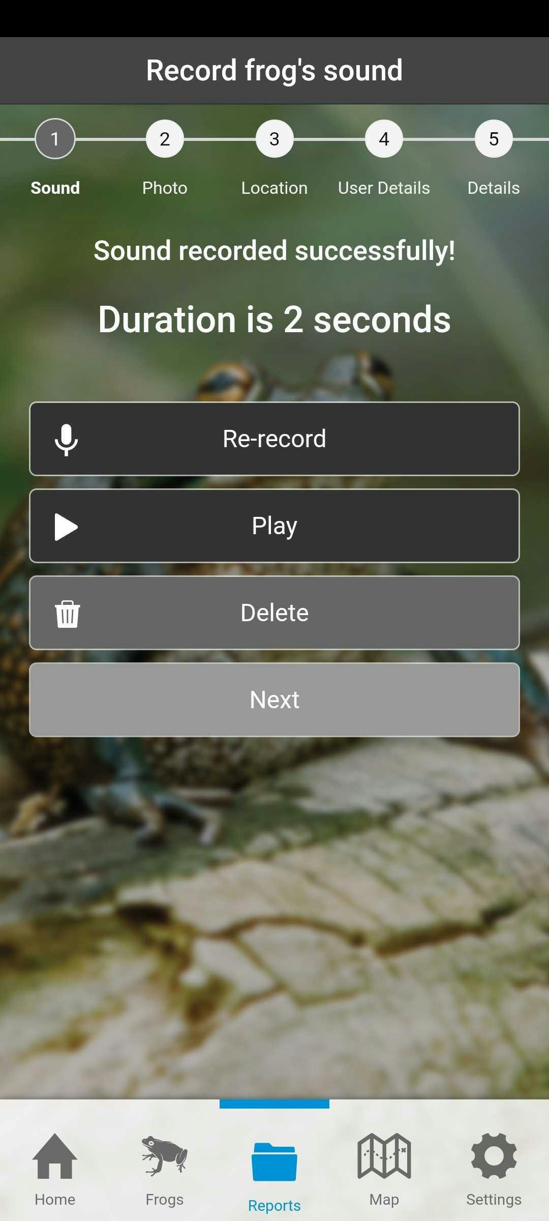
Here is the same concept used in an app that let you report frog sightings. You can record the frog's sound, take a photo of it and fill out more details to complete a report.
Another example is from YouTube video upload flow.
Angular Material has a stepper component that can help with this.

4. Make it easy to understand where the user is in the navigation flow.
You can use a breadcrumb for this. The following example shows what is the user selection using a breadcrumb.
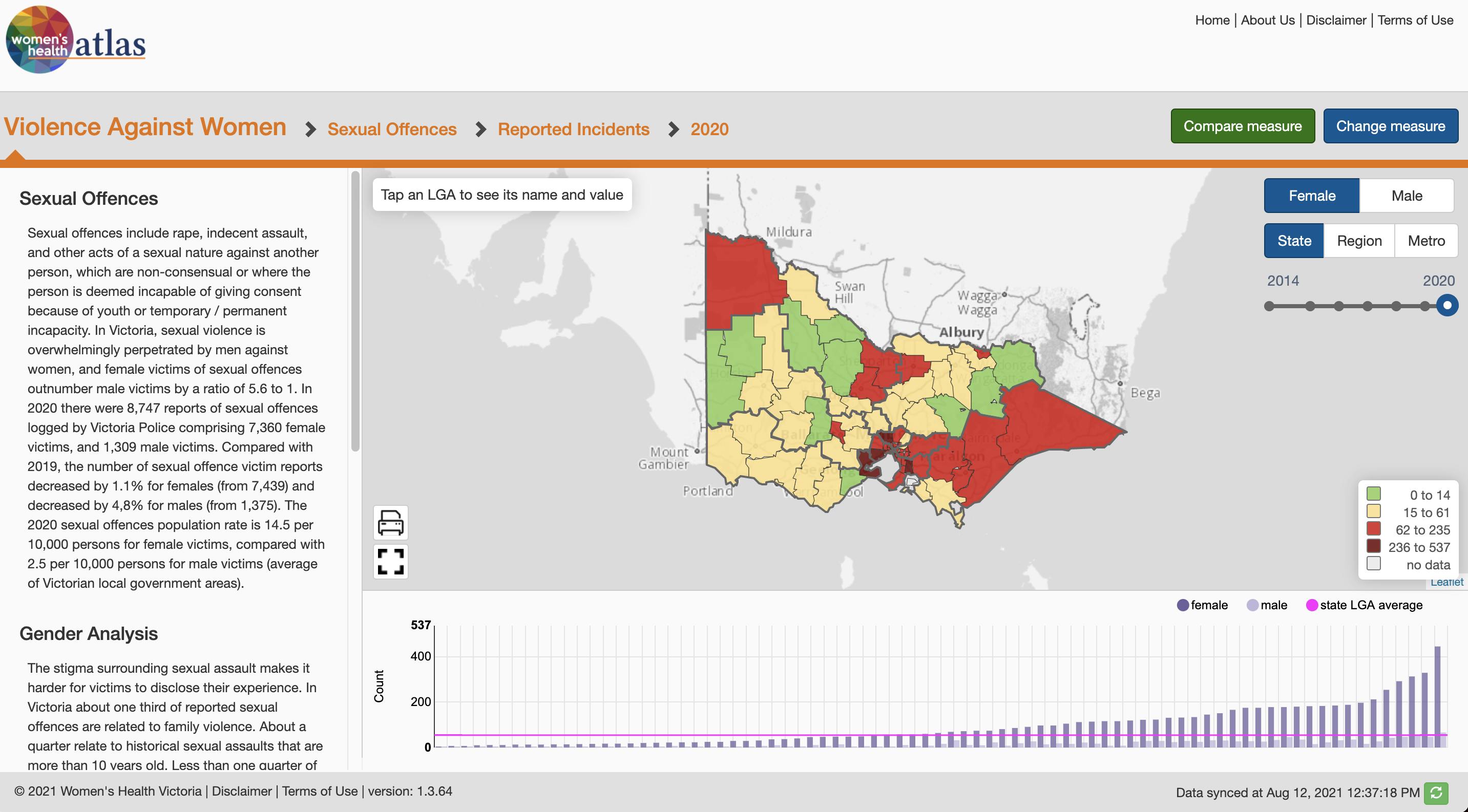
Also, using a column browser makes it easy to see the hierarchy of data and select a category that matches the breadcrumb that users see to remind them how they got to this selection.
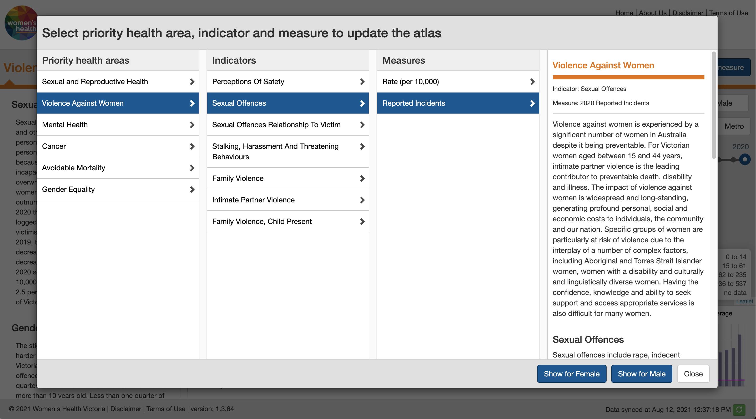
You can use the same concept on the phone. Here is a demo of Ionic 6 breadcrumb.
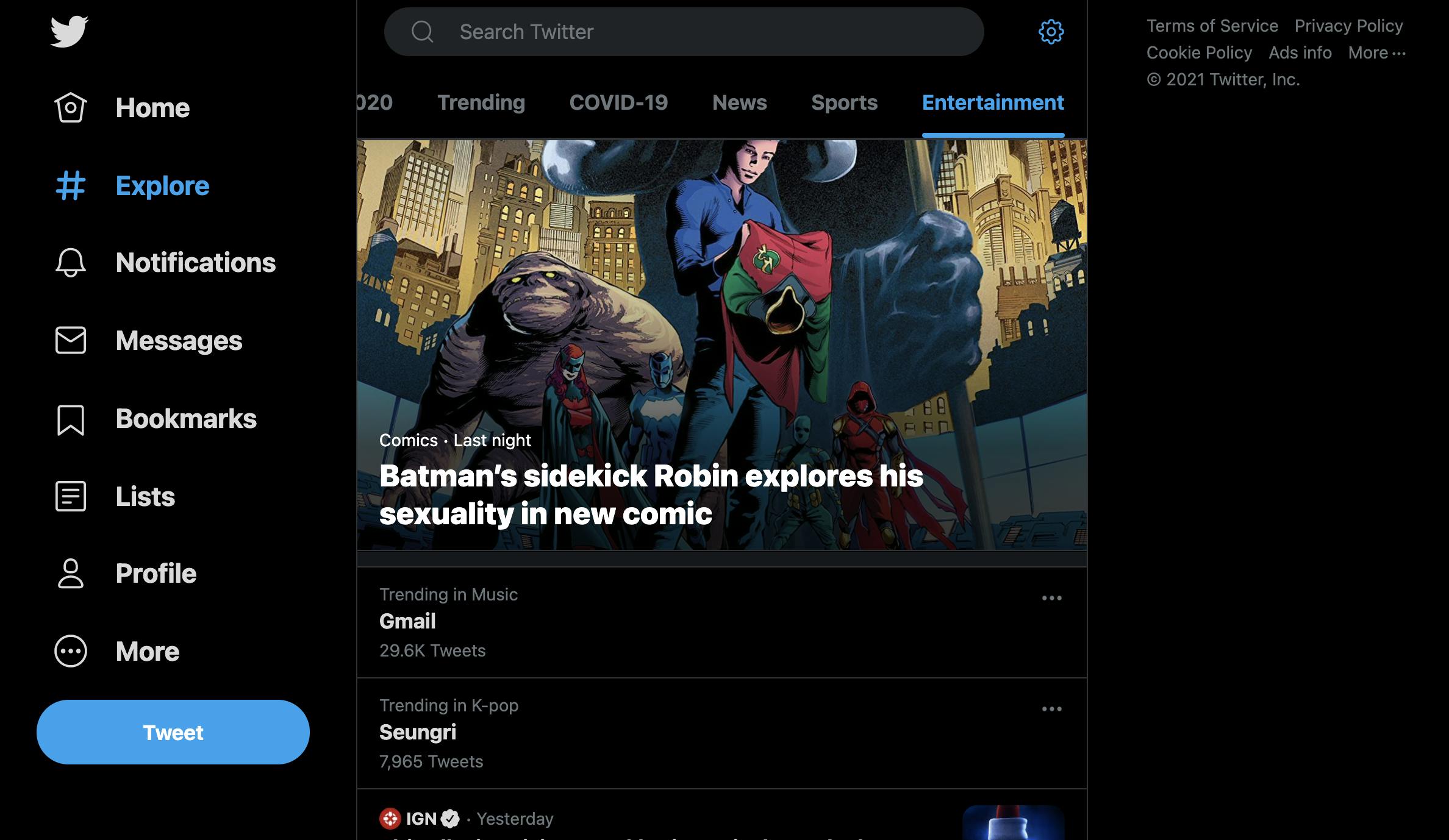
Similarly, you can highlight the selected item in the main navigation or tabbed navigation to clarify where the user is.
Look at how Twitter uses the blue highlight on the left side menu and top tabbed navigation to tell me I am on the "Explore" tab and looking at the "Entertainment" list.
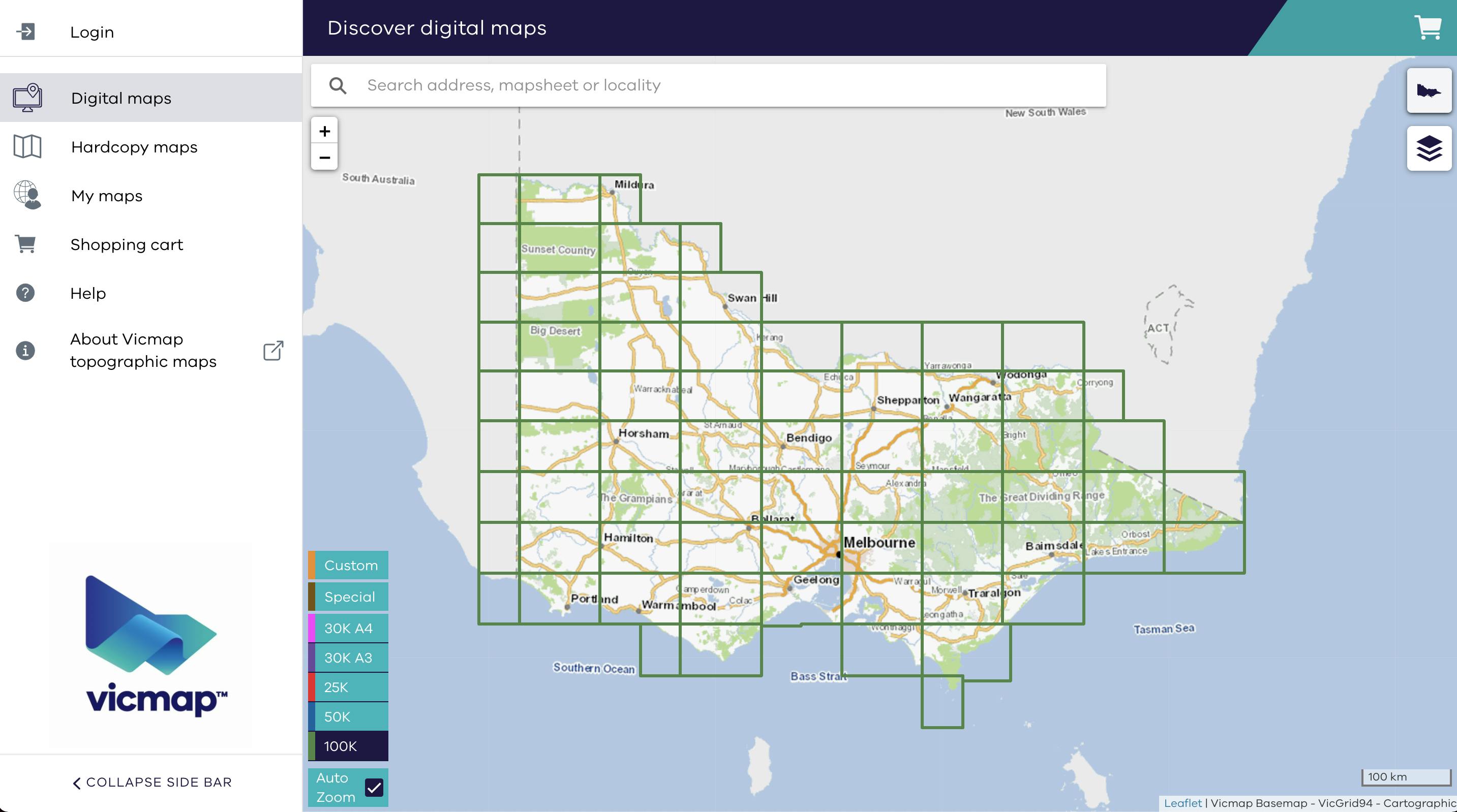
Another example from Vicmap Topographic Maps highlighting the menu (Digital maps) and the selected scale (100K).
5. Show the system is busy using a loading indicator
This is an obvious one, but I have seen devs overlook it many times. The main reason is that when you develop on your local machine, you are literally using a server, so the connection is fast, and you never need to wait for the response.
I have some news for you that not all users are on a fast connection, and they will appreciate knowing the application is doing something behind the scenes. 😀
This can be a simple loading indicator or progress bar.
Almost all UI components libraries have a component for this.
The material design calls it Progress indicators.
Ionic calls it Spinner and Progress bar
Another example from pull to refresh in Ionic to show app is fetching the list behind the scene.
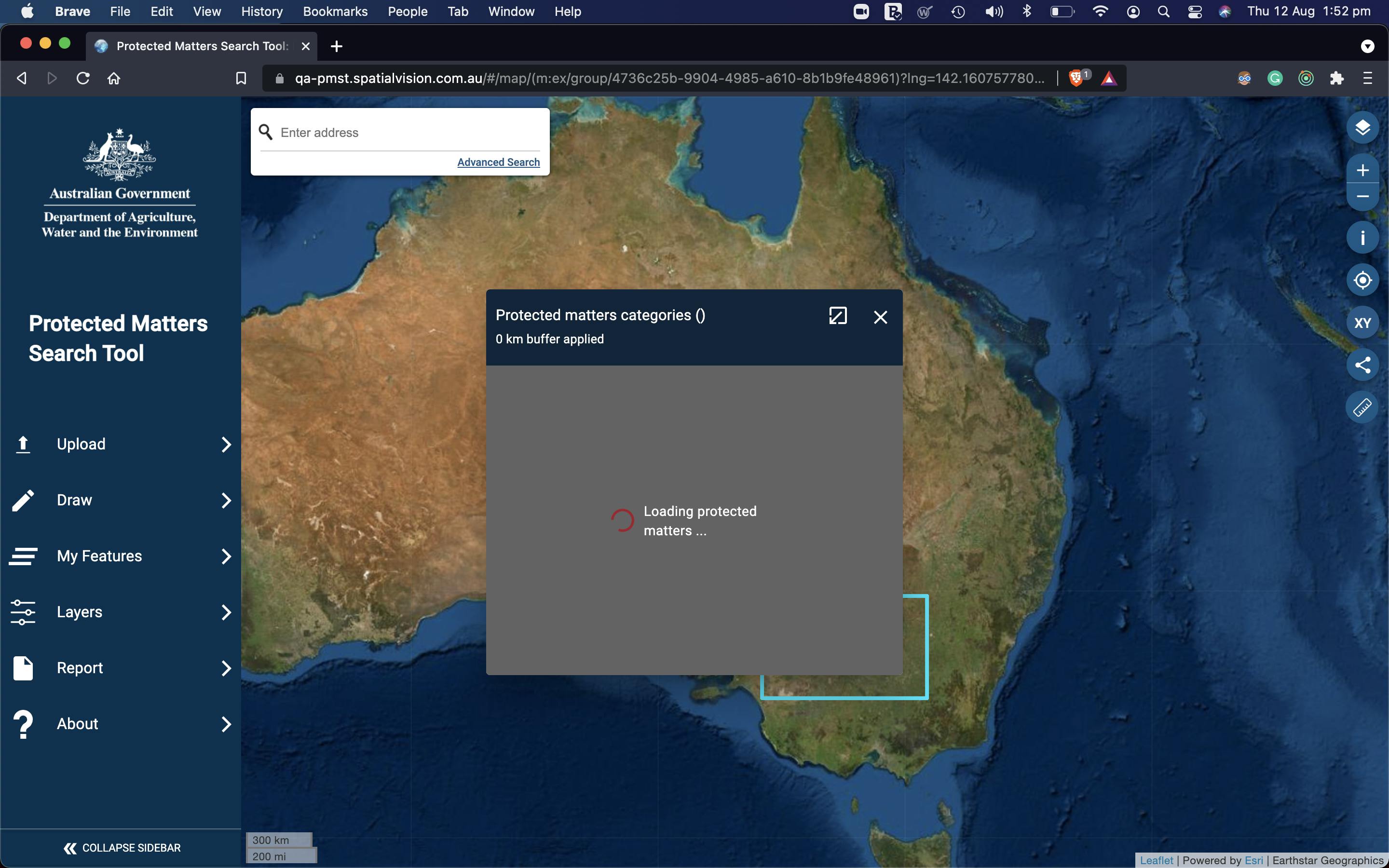
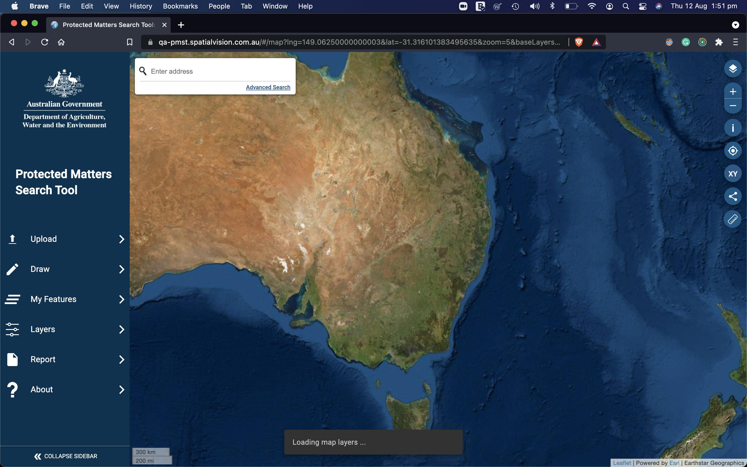
In the PMST web app, users can add layers to their map. These layers are usually shown using large images on the map, changing as you pan and zoom.
Obviously, I could not show a loading message each time user interacts with the map. That would block the user, and if loading happens quickly, the message would flash for a second and go.
It would be too annoying, so I use a toast (snack bar) message at the bottom of the screen that only appears if the loading of a layer takes more than 3 seconds, so the user knows we are trying.

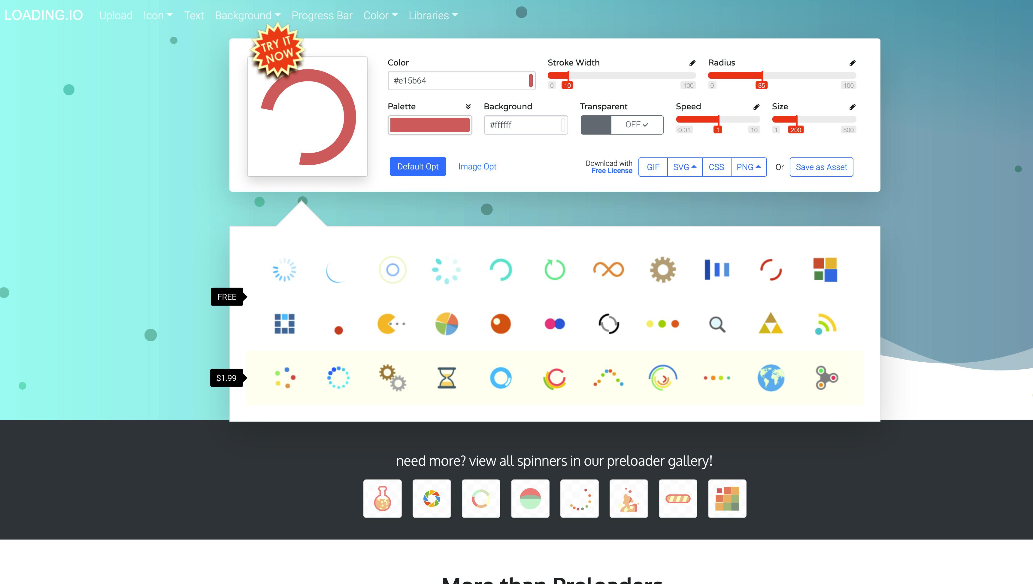
Regardless of the UI library you use, many websites provide loading gifs or SVG animations. Like loading.io
If you have more space and feeling fancy, you can use a loading animation from lottiefiles
Bonus
If you are interested in using Lottie animations with Angular or Ionic, I have an example project that might help you.
6. Provide timely feedback to users using micro animation
This is one of my favourites. Micro-animations are small, preferably functional animations that support the user by giving visual feedback and clearly displaying changes.
Have you noticed Twitter like animation?

Many UI component libraries have this built-in.
For example, the Ionic Fab button uses a scale animation and morphs the arrow icon to the close icon to provide visual feedback. (iOS style)
This example shows how Ionic provides the micro animation for the tap on cards based on iOS or Android design guidelines.
7. Haptic feedback for touch devices
The Haptics provides physical feedback to the user through touch or vibration.
Simply put, you use the device vibration hardware to provide feedback to users when they tap a button or do a long press. The vibration pattern can be different based on the feedback.
For example, an error can cause a longer vibration.
The vibrate API is available in JS through Navigator.vibrate()
navigator.vibrate(200); // vibrate for 200ms

navigator.vibrate([100,30,100,30,100,30,200,30,200,30,200,30,100,30,100,30,100]); // Vibrate 'SOS' in Morse.
If you use Ionic with Capacitor, this is provided out of the box through the Haptic feedback plugin.
Conclusion
We looked at the first rule from the "10 Usability Heuristics for User Interface" and explored how it is implemented in web or mobile UI/UX we build every day.
I just scratched the surface with this article, and there are many more ways you can improve the visibility of the system status.
Usually, you use a combination of all these techniques based on the context.
I encourage you to read the original article as well.
I hope you enjoyed reading my article, and as usual, if you have any comments, please let me know here or DM me on Twitter.
Twitter: _pazel

